Last.fm is a great music service that keeps track of your listening habits. Though you can view stats such as last played tracks, top artists, or most played songs with just words and numbers, it can be limiting in so many ways. We’re huge fans of visualization tools, so wouldn’t it be cool if you could grab a visual history of your Last.fm stats? LastGraph is just the service for the job.

Getting Started
Using the Last.fm API, Andrew Godwin writes and runs LastGraph, a great Last.fm visual history tool. To start, just enter your username to hit enter to get a queue ticket. LastGraph is a beta web app so there are some kinks and issues. A queue happens to be one of them. Fortunately you shouldn’t have to wait more than 30 seconds for the page to refresh with a nice selection of visual goodies.
LastGraph grabs the last 20 weeks of data, which is a lot if you happen to use Last.fm on a regular basis like I do. The following stats are available for visual displaying:
- Artist Histories
- Quick Timeline
- Timeline Posters
Artist Histories
Artist histories allows you to see your latest artists sorted by the most played artists at the top. Clicking on a name will display a visual graph showing how many times an artist was played over the past several months. Take a look at my chart for Linkin Park:
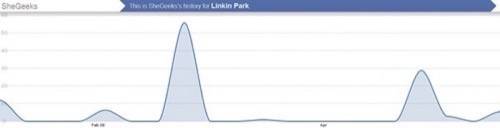
If you click on the image to enlarge the graph, you’ll notice that that there are some really big gaps in the graph. While Linkin Park is one of my top 5 most played artists, I don’t listen to them very often and the gaps in the graph show this. l just recently picked them up again and now they’re dropping back off. The great thing about having listening habits displayed in this manner is that you can find out what a user’s current listening tastes are. While Last.fm will tell you they’re one of my favorites (which they are), LastGraph will tell you that I’m currently exploring other artists at the moment.
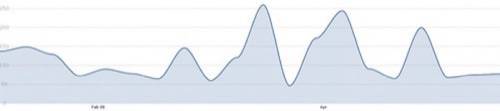
Quick Timeline
Quick Timeline is another visual graph that gives you a view of your overall listening habits. Last.FM may record your listening habits, but doesn’t provide a way to keep track of how many songs you’ve listened to within a specified length of time beyond a week. You have no way of comparing how many songs you’ve listened to in the past month versus this month. LastGraph’s ‘Quick Timeline’ view give a great resolution.
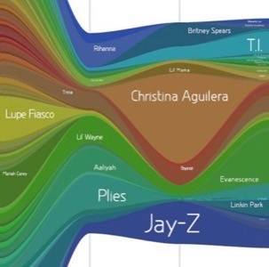
Timeline Posters
LastGraph provides posters of your viewing history. The result is a complicated but useful representation of your listening habits. You can specify a period of time you’d like to have a poster generated for, the color of the poster, and the amount of details you’d like the poster to have ranging from terrible to super. There’s another queue for the posters which could take several minutes to render depending on the length of time specified, the detail level, and the number of user requests. The posters are available for download in PDF and SVGZ format. Here’s a look my poster for the month of May, rainbow style, with super detail!
Last.FM Should Incorporate LastGraph
All of the data provided by LastGraph is available for exporting in Excel, CVS, and JSON formats. You can even get individual artist data from the ‘Artist Histories’ page. What I’d like to see next is an expansion from artists to songs. It would be cool to see how often I’ve played certain songs like Misery Business By Paramore throughout several months or days.
If Last.fm could incorporate all their data in the same manner, you could get an alternative way of seeing your compatibility with other users. The data could be used not only for finding users that match our music tastes overall, but also our current tastes, which could be a more relevant match for users that constantly change their listening habits and music styles.