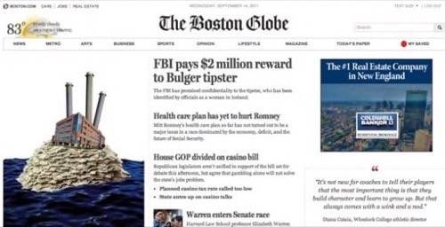
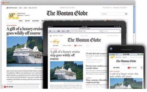
On Monday, The Boston Globe released its new premium content mobile initiative dubbed BostonGlobe.com. That is not to be confused with Boston.com, its free flagship website. This unto itself is not all that interesting. Yet, the HTML5 development community is heaping praise on BostonGlobe.com primarily for how the sites renders across varying screen sizes, an innovation called responsive design.
Responsive design allows the Globe’s content to be refitted to any screen size available automatically. It is a win in the fight against mobile device fragmentation and screen sizes and the future of how content is displayed on mobile devices. Below is an in-depth discussion with the creators of the Globe’s responsive design and the challenges they faced along the way.
Editor’s note: This story is part of a series we call Redux, where we’re re-publishing some of our best posts of 2011. As we look back at the year – and ahead to what next year holds – we think these are the stories that deserve a second glance. It’s not just a best-of list, it’s also a collection of posts that examine the fundamental issues that continue to shape the Web. We hope you enjoy reading them again and we look forward to bringing you more Web products and trends analysis in 2012. Happy holidays from Team ReadWriteWeb!

Filament Group Makes A Big Step In The Evolution of HTML5
The Boston Globe enlisted the services of Filament Group, a Boston-based design and development firm that focuses on accessibility. Below is a transcript of a conversation between ReadWriteMobile and three Filament Group designers and partners that were instrumental in bringing responsive design to reality. Todd Parker and Scott Jehl are both partners while Mat Marquis was one of the main developers that was “camped out” at the Globe during the design process. The man they call the “father” of responsive design, Ethan Marcotte, was not available to comment at this time.
Check out BostonGlobe.com’s responsive design in action.
On how it got started
Todd Parker
I think we started the project in November. We started the front-end templates and were working with the designers up until late spring and then we have been doing a lot of integration support through the summer up until the launch.
Technical Challenges
I think up until now it has only been used in blogs and portfolios and things like that. The pieces have been there but it just hasn’t been put together. I think it is also having a client that is that this is brave enough to say that this important for their business and makes the leap. Because it does take more time and more testing and things like that than your typical Web developer that can just throw something together.
So, in terms of technical challenges, I think a lot of it was media queries. A lot of things are reliant on media queries and Internet Explorer doesn’t really support them in the versions that you can target. So, one of the things we had to target was a polyfill that can be used for media queries. There were some others out there that were too slow for our needs and so we created RespondJS that is a really fast, lightweight polyfill for media queries. That is one of the first things that we kind of had to solve on this project to really make it work. Otherwise it was just too slow.
The other big challenge that we were working on here was responsive images. So, everything we are doing is taking a mobile-first approach so that means that the page that is served up is as lean and lightweight as possible and that includes images. So, if you look at the Globe’s site they have these big images that are a thousand pixels wide and they are really big and really rich, like the Big Picture, on all the article pages. So, what we doing in the HTML is actually referencing a smaller, low bandwidth image and we figured out a little trickery that if you are on a device like a tablet or a desktop that could use the high resolution image and if it does that is a loaded reaction flip. So, if you are on mobile you get the low resolution image and if you are on a browser or a tablet you get the high resolution image. So, delivering the appropriate image to the appropriate device was another technical challenge that took up quite a bit of work to actually work in a real CMS environment.
On Challenges Posed By Advertising
Matt Marquis
I think one of the real challenges was not knowing what the challenges were going to be and kind of uncovering a lot of new problems here that no one has solved in the past. So, it requires a lot of new solutions that no one has never thought up. It is a lot of hard work.
Parker
I think we did a good job of kind of authoritatively solving those issues for the Globe. One of the trickier ones that is still a bit unresolved is advertising. Ads do all sorts of really ugly things with Javascript and reaching into the page. Getting those to be sandboxed and safe and not turning the page into some heavy broken mess was a pretty tricky solution.
Marquis
We have a pretty solid solution in place for those now. The general rule is that the more obtrusive they are from a user perspective, the tougher they are on us. We don’t have any giant interstitials, we don’t have any ads taking over the whole page which would be a lot more challenging to deal with. We have a couple of box ads and a couple of banner ads that are pretty easy to deal with now. We can sandbox those and keep them from destroying everything else that is on the website.
Parker
There is the technical side of advertising and making sure that plays nice with our approach. That was tricky. The other thing is that the way that ads are sold hasn’t really caught up with this approach. So, they are selling ads for mobile placements in mobile slots and then there is desktop. We are covering such a broad range and we are not making distinctions between those. Where does a seven-inch Android tablet fit into that? Where does the Kindle fit into that? It is this really broad continuum of devices and capabilities. So, this allows us now so that we are basically serving up one ad and just positioning it differently on the page in the CSS. So, it is kind of a single-advertisement approach.
Challenges of Device Recognition and Varying Screen Sizes
Marquis
As far as that goes, we are targeting screen size in terms of display in terms of the features in terms of what we are serving up to the user. So, really, there is no situation where we are saying ‘OK, so, if they are on a Android then they get XYZ, if they are on an iPad, they get this that and the other thing.’ Really, it is about if they have a device that sports touch then the specific touch feature and will specifically add Javascript. So, we are not serving it up to everybody but just those that have the feature enabled. We would never say that the iPad gets this layout. It is just any screen between one size and another size gets this layout.
Parker
We do not do any user-agent detection. That is a big no-no. So, it is very open ended. So, that is all focused on features and capabilities and we test for those and then dynamically load things in as needed. So, that is why each device gets a bit of a tailored experience in terms of what they download. This tablet here may support touch events and this one doesn’t. It might have different resolution and might be getting a different layout.
Marquis
It is clear that we did not plan under any circumstances for anybody to be opening it on a GameBoy, but, when somebody did recently, it worked great on a GameBoy.
Parker
I think the great upside of this is taking a much more agnostic approach rather than targeting any specific user agents. It is all about targeting capabilities. That way when we are working with jQuery mobile, when we get new test devices (and we get new test devices all the time), as they come in and we crack it open and look it on some devices that hadn’t been on our radar before and the Globe will look great on it because we don’t have to worry about that. So, as devices come out it is a very future compatible approach and works on all the older devices because we are working on progressive enhancement. It will work on your Newtons and old Palms and things like that.
How Is This Possible Now As Opposed To the Recent Past?
Parker
I think it is one of those situations where a year and a half ago maybe this could have been done, it is just a matter of putting all the technical pieces together.
Marquis
I think some facets of this could have been done in the past. I mean, HTML5 has a lot more APIs available for targeting features. Like, being able to check for touch support is technically part of HTML5 even though it is not HTML5 markup. So, that definitely allows us to do all of that conditional loading and such. In terms of the markup itself, we are doing a lot of HTML5 with additional semantic meaning, it could have been done in HTML4, just not meaningfully in terms of the markup.
Parker
For us, we have been focused on universal access. That has kind of been our thing. We have been around for 10 years. I is not just us. I think a lot of people have slowly been putting pieces together and now I think we have the core tools we need to make this really feasible. For example, we wrote a book on progressive enhancement a little over a year ago. That is the foundation that the Globe is built on. To serve up clean semantic HTML and layer on top of that CSS and Javascript in a clean and unobtrusive way. Now we are making more distinctions. Instead of saying you are going to get this enhanced experience because we have more capabilities. Basically what we are saying is that based on your screen size, we are going to target the layout even further.
Marquis
I think my favorite example of that would be the plans for the crossword puzzle which seams like a pretty simple component on the site. We are starting with semantically meaningful markup generated by the server. So, no matter what your capabilities you get a functional crossword puzzle where you can fill in answers just the same as a newspaper with no frills, no nothing. Later on down the road, if a user’s browser supports local storage with is just a matter of saving things within the browser, we will be able to click a button and it will say to those users ‘save this puzzle for later” and they can leave, come back, start it over. That kind of thing.
What Is The Next Step In Responsive Design?
Parker
We actually do a lot of application designs for enterprises and things like that. I think a challenge for us would be to do something much more functional. The Globe kind of proves out that you can do some really cool things when it comes to laying out content. But, what if you have an application that has a lot of GUI rich visualization or you are doing tabular data like a business application. I think that is the next thing to be proven. I am confident that it can be done and it is just a matter of jumping in and doing it. We are actually working on some projects for some of our other clients that are touching on those areas. So, it is an interesting time.
On Other Challenges
Marquis
Third-party services were one of the biggest challenges we ran into. Just serving up the ads and other features, we had to find work-arounds on our side to figure out the markup and scripting that they would serve up just by default.
Parker
One of the things to think of in terms of the design is the process is that you are thinking about this broad continuum of devices that you are targeting. Everything from a smartphone up to a widescreen desktop, say 1200 pixels or even larger. So, when we are designing these pages we are thinking about what is the right deliverable to be putting those designs together.
There was a really close collaboration there (with the Globe and Upstatement) … There is a lot of finessing that needs to be made between [screen sizes]. I think it definitely changes the design process because there is no static comp to adhere to.
Marquis
There is no baton-style hand off process where you just give it to the next team and they just run with it. It kind of requires a constant dialogue.
At this point, Scott Jehl, who specializes in UI at Filament Group, joined the conversation to talk about the tools that were used.
What Tools Did You Use?
Scott Jehl
Throughout the site we used jQuery for the bulk of the site. We used jQuery mobile in a couple of places for things such as photos and touch interaction. I think underneath, before jQuery is even loaded, we built a custom framework for the code that handles dynamic loading of Javascript. So, that allows us to load only the most minimal amount and then dynamically load the rest. Just so the content could be there immediately. It is a behavior that is nice to have.
Yeah, so it was mostly jQuery and then our plugins on top of it to not only make the layout responsive visually but also behaviorally, changing the behavior of all the component and adapt to touch and different interactions and conditions that will make sense in certain contexts and not in others.
In many ways we are using jQuery the same way that many other sites are using it. jQuery itself doesn’t really do anything. It kinds of sits there and provides utilities that you can use and we built on top of that. I think the only main difference and this is not really a unique feature to the Globe necessarily is that we found that if we loaded jQuery dynamically we were able to get great performance on older devices. Like an older BlackBerry like a 4.5 or 5 that were not running jQuery. Because of the way the site is constructed to make that call late in the game and say the experience on this device is kind of a lot better just serving up the basic features.


