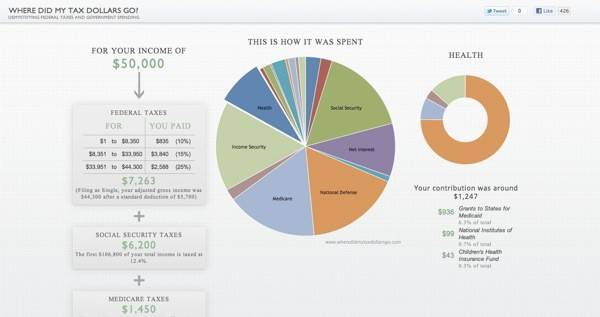
Just in time for tax day here in the U.S., Google’s Data Viz Challenge, a five-week developer competition, ended and the Grand Prize winner announced. The winning entry is called simply “Where Did My Tax Dollars Go?” and was created by Anil Kandangath. The Google-sponsored contest asked developers to use data visualization techniques to demonstrate how our federal income tax dollars are being spent. Over 40 developers submitted entries that offered everything from pie charts to bar graphs and more in order to make this complex data more accessible and understandable by everyday taxpayers.

Curious to see how your tax dollars are spent? Check out the winning visualization below.
The jury selected Kandangath’s entry as the winner because it is both “information-rich” and “elegantly designed,” wrote Jenny Ramaswamy of Google’s Creative Lab on The Official Google Blog, “and at no point while interacting with the visualization do you lose the big picture,” she said.
You can launch the winning project from this page here to see it in more detail.
Google also created a showcase of all the entries in a short video that nicely demonstrates the creativity involved with this contest.
The Data Viz Challenge was launched in February of this year in conjunction with Eyebeam, a not-for-profit art and technology center that served as the event host, and WhatWePayFor.com, a website that uses public data to estimate how tax money is spent. Andrew Johnson and Louis Garcia, who run WhatWePayFor, created an API (application programming interface) to provide developer access to their site’s data.
The Grand Prize winner received $5,000 in prize money in addition to a timely mention on The Official Google Blog. Even if you’re not typically a data visualization enthusiast yourself, it’s hard not to be impressed (or perhaps, shocked), by the results.