I am a sucker for data visualization. I am less enamored with infographics these days as I have noticed some hijacking of the medium for public relations stunts. Taking a few anecdotes and drawing some arrows does not cut it in my book.
Anyway…moving on.
I did find this excellent post this morning by Jacob Gube on Six Revisions that gives an overview of 20 JavaScript libraries.
Gube says the JavaScript libraries “turn boring numerical data into beautiful, interactive and informative visualizations.” I can agree with that.
Here are five libraries that I picked out from Gube’s post:
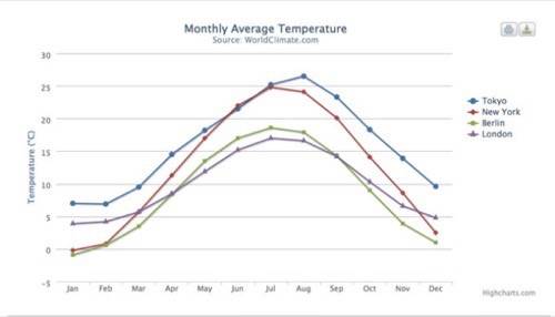
Highcharts
Highcharts offers seven charting types such as line, pie, and bar. You can zoom in and out of charts. It offers tips with more information about data points. Documentation is excellent.
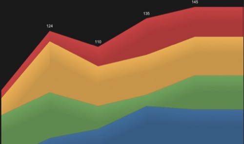
JavaScript InfoVis
Gube writes that JavaScriptInfoVis is similar to MooTools, a modular, object-oriented JavaScript framework designed for intermediate to advanced JavaScript developers. Due to its modular format, you can use JavaScriptInfoVis to keep your pages light. It also includes an animation effects capability, multiple charting types and a class for working with JSON data. There are several demos that show how to use JavaScript InfoVis. JavaScriptInfoVis is the work of Nicolás García Belmonte, a senior software engineer for Sencha, which provides developers with frameworks, tools and services to build Web application experiences using HTML5 and JavaScript. You can see the passion in his work from examples such as the demo for this stacked area chart.
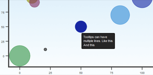
moochart
moochart is a MooTools plugin. moochart plots bubble diagrams. It will eventually expand to feature pie, line, and bar graphs. moochart is open source and released under the MIT license.
StyleChart
StyleChart is an API for creating charts. According to Gube, it includes tooltips, legends, and 19 types of charts including 3D pie, 3D bar graphs and Pareto charts.
TufteGraph
According to Gube, the TufteGraph is a JQuery plugin that emphasizes minimalism and ease of use. It offers only a few options for styling. This has its upside as it instead relies on CSS for customizing the look and feel of your graphs. It also helps speed up Web pages as the there is less load placed on the JavaScript.
I encourage you to explore all 20 of the examples that Gube has collected for his post. They well demonstrate how JavaScript and data visualization are so innately tied.