Most of the time we only get one view of a disaster like the floods ravaging Queensland, Australia. Media organizations convey the news but seeing people in harms way posting reports for a crowdsourced map is a new form of reporting that gives immediacy, a sense of connection and a fast way to assess the magnitude of a disaster.
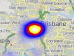
Over the past several weeks, the Australia Broadcast Corporation (ABC) has been doing something a bit different by using Ushahidito create a data visualization of the Queensland floods that have left the region covered in water. The crowdsourced map is powered by people in the region and professional journalists covering the disaster. It’s an encompassing view of the disaster, evoking a sense of real-time drama and a full context about the flooding’s impacts.
This is the second compelling visualization we have seen of a natural disaster this week. Earlier this week, we reported an email interview we did with journalist Peter Aldhous who created a data visualization in R that shows how Haiti’s relatively low seismic earthquake had as many fatalities as all but one earthquake in the past four decades. R is a software environment for statistical computing and graphics.
The Haiti graphic provides a historical context to the earthquake and its impacts. The Queensland data visualization is a real-time reporting mechanism for pointing to events such as a road closures, emergency evacuation routes and property damage.
ABC says on a Web page about the project that it is experimenting with Ushahidi to create the data visualzation:
ABC correspondents, reporters, presenters and photographers have been covering many dimensions of the flood disaster. However, the mainstream media cannot be everywhere at once.
This Crowdmap aims to combine verified reports from government agencies and media outlets including the ABC but potentially invaluable information supplied by people like you, who simply see, hear or record incidents or situations due to the floodwaters.
ABC goes on to explain that the platform has its own iPhone app, which can be used to report incidents and see the crowdsourced map.
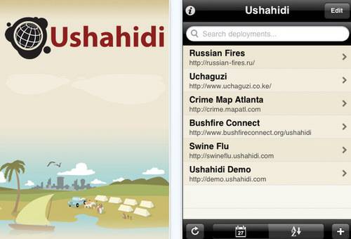
Ushahidi emerged during the ethnic cleanings that plagued Kenya in 2007. Citizens used it to report incidents. ABC points out that four days after the Haiti earthquake, the Ushahidi platform received 100,000 reports from the ground.
Some of the reports from Queensland are quite dramatic as they provide a narrative context with the categorized data that is seen on a map. They mark each report verified or not. That helps give some idea about the checking process that needs to be done with these kids of projects. The map may not be completely accurate. Viewers need to take that into consideration when using it, especially if they are considering traveling in the area.
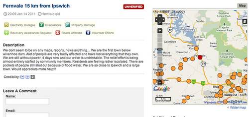
The UX for the map provides ways to view the map by category, by media type and chronologically by events. It has an updated feed about news in the region.
The map may be seen in street view, OpenStreetMap, satellite view or by topography. ESRI provides the geodata for the satellite imagery.
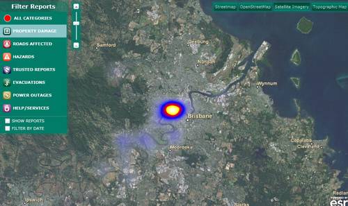
The ABC must have its mind made up about Ushahidi. It aggregates Twitter feeds and information from multiple sources. In looking at the map, you can see where the most significant devastation is occurring. That has to help in planning where to place reporters, photographers and videographers. And it helps expand upon coverage. It’s also a service that gives ABC a tremendous responsibility to provide the most accurate information possible. People in the region literally depend on it for coordination, planning and to seek help.
Ushahidi represents the future of coverage for breaking events and disasters. This is getting proven again and again. The Queensland project extends what it means to be in the media. The service shows how critical the media are in reporting and sharing information. Now it’s just a different magnitude of data that needs to be filtered so they can keep doing what they do best – getting out there and telling stories.