In any relationship, business or personal, first impressions are critical to getting off on the right foot. For startups, if a user gets a bad first impression of your website, that same sentiment will carry through to their opinion of your service. A few weeks ago we told you about some pointers to make sure your site’s registration process isn’t scaring away users. A recent post on web development blog Six Revisions focuses in on this issue by providing some techniques and best practices for creating and designing the perfect registration button.

Besides being aesthetically pleasing, the design of the registration button can benefit from the following three suggestions, according to Six Revisions’ Dibakar Jana. First, the registration button needs to be above the fold and preferably in close proximity to a description of the main features of the site or product. There’s nothing worse than visiting a site you find intriguing only to waste precious time searching high and low for a poorly placed “register here” button. Don’t get caught up by placing too much information on your site’s landing page. Sometimes less is more.
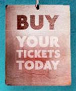
Secondly, an appealing registration button can go beyond being near the main features of the site by actually including those features in the button itself. By this, Jana means that buttons which say “Try now with a $2.00 credit” or “Buy Your Tickets Today” (examples Jana provides from InstantLoop and Vegas Uncork’d) speak louder than a simple “Sign Up” or “Register Here” button. You’re trying to convince visitors to your site that your product is unique, so try for some originality in your registration copy.
Finally, aside from telling visitors what all the great features of your site are, show them why they should sign up. Do registered users stand to benefit from your site’s services more than casual browsers? Baramail beckons users to “Sign up now for a free account” while others like Myzeo offer “one year of FREE Coaching” in their sign up buttons. The more a user knows about what they’re getting into, and why registering for your site is a good idea, the more likely the are to follow through.

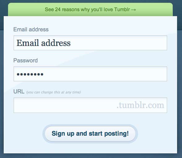
Take Tumblr‘s registration process as a shining example of originality and excellent copy and design. A visit to the site’s homepage reveals their motto, “The easiest way to blog,” set in a large font size directly above an equally oversized registration form. The form, which sits beneath a cleverly placed “See 24 reasons why you’ll love Tumblr” link, asks for just an email address, a password and a personal Tumblr URL choice – all displayed in an absurdly yet amusingly large font size. Finally, the site invites registrants to “Sign up and start posting!”
Whichever route you chose, just be original. Avoid using boring and simple “Join” buttons, or worse, a registration form which ends with the cold and thoughtless “Submit” button. People don’t want to feel like they are “submitting” their information to you, help them feel welcomed in a warmer, more personal way. If you need inspiration, be sure to check out Jana’s post on Six Revisions for dozens of examples, then pass your friendly suggestions along to your web designer. Remember, you only get one chance to make a first impression.