For many of us, our tributaries of social data find their way into our lifestream, an aggregated collection of our online activities. More often than not, that stream appears as a collection of text entries: the most recent item followed by the second most recent, and so on. While the progression is obvious, what’s not so clear is the passage of time. Those data points could be seconds apart – or months apart. Enter Dipity, a service that takes those moments in time and plots them along along a timeline, providing an entirely new take on the activities we’re pursuing and how they relate.

We first encountered Dipity, last year, at the Graphing Social Patterns West AppNite where it was demoed as a Facebook app. Since then the site has added a number of new features – most recently an import tool for now-defunct circaVie data – and dealt with some uptime issues. We thought it was worth taking a second look.
Getting started with Dipity is easy. Simply start feeding the service your data: photos from Flickr or Picasa, blog entries, RSS feeds, music from Last.fm or Pandora, videos, or microbloging feeds. Anything that offers a publicly accessible feed is fair game.
And that means, that it’s not just your data. It’s any publicly accessible data. If you want to add data from other RSS feeds – say you wanted a timeline showing when the top tech blogs publish stories – you can do that, as well. Or maybe you’d like to add content from a Google alert or Yahoo! Pipes? Or build something with Dapper to populate your timeline? All viable options. Suffice it to say, there are any number of ways to feed Dipity.
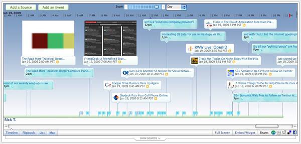
But, the true value of Dipity is how it lets you visualize that data. Once the sources are added, the service plots each discrete element along a timeline. And that view of the data provides a very different perspective of “what’s happening when.” You can also zoom in and out of the timeline – down to hours or out to years – to help provide additional perspective.
It’s a like a graphing engine for your lifestream – or any combined stream of reference data.
After only a few minutes, I was working to push all sorts of random collections through the tool. No doubt, you’re already thinking of some very interesting data sets to run through it, as well. And if you’re short on ideas, the folks at Dipity have compiled some interesting timelines to inspire you.
Interested in taking a different view of the data you’re producing? Visit Dipity and register for a free account.