Web 2.0 has brought many wonderful innovations and ideas to the Internet.
We can no longer imagine the web without a social dimension, and we can no longer imagine
an online world that is read-only – it is now a read/write web full of user-generated content.
But there is another fairly recent innovation, which might have just as profound implications. We’re speaking of the contextual user interface.

Even five years ago we lived in the boxed world of Windows-dominated UIs.
There were standard UI elements – menus, tabs, combo boxes, tables – and every single desktop
application was full of these elements and nothing else. User interface was not the place
to be innovative. It was considered unorthodox and even dangerous to present the interface
in non-standard ways because everyone believed that users were, to be frank, stupid, and wouldn’t want to deal with anything other than what they were used to.
Strikingly, the recent wave of UI innovation is proving exactly the opposite. Users are not
stupid, and in fact, they were overwhelmed with choices presented in traditional UIs. The new interfaces
are winning people over because they are based on usage patterns instead of choices. The key thing
about new UIs is that they are contextual – presenting the user with minimal components and
then changing in reaction to user gestures. Thanks to Apple, we have seen a liberating
movement towards simplistic, contextual interfaces. But can these UIs become the norm? In this post we
take a look at the rise of the contextual UI and ponder if they will cross the chasm.
Windows UI – The World Of Never-Ending Choices
Looking back at the years when Windows dominated our lives one can hardly
believe what we put up with. These interfaces were massive and overwhelming. Each application
was full of screens with huge numbers of options and settings.

Every imaginable choice was thrown at users
at once and it was up to the poor user to figure out what to do. To cram more information onto the screen,
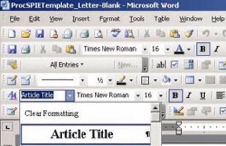
the interfaces of that era used tabs. At some point Microsoft invented the ultimate UI element – a tab with a scroll button in the end which allowed the user to page through hidden tabs.
Another philosophy of the old UI approach was that the user wants
to see all information all the time. Instead of building UIs that responded to the way that people actually
interacted with the tool, the user interface opened up all possible choices at all times. Naturally, this is
completely overwhelming and confusing to people.

The only way to cope with complexity was to introduce
a standard set of widgets, such as tables, combo boxes, check boxes, etc., so that users at least had some
familiarity with UIs from program to program. But on top of that, there was a myth spread that users were stupid and would not be able to understand
a non-standard UI.
The myth was supported by the fact that a lot of people do not respond well to sophisticated
visualizations, like graphs, heat maps, or treemaps. While this is true, it doesn’t mean that people can not figure out new user interfaces.
The proof comes from Apple, which continuously innovates with new UIs for its software products. Also, recent social web applications
have made a strong case for simpler, contextual user interfaces.
Apple’s Revenge
Since Steve Jobs returned to Apple over 10 years ago, the company has been on a roll.
The secret sauce behind Apple’s success is a strong investment in software. In turn, this has meant a lot of innovation is user interfaces. Many years
ago, when I myself was blinded by the standard Windows UI, my boss told me that user interfaces are cheap. He meant that
building new UIs from scratch makes sense, because the UI
is so essential and so important to get right that you shouldn’t just reuse code and widgets.

Steve Jobs and his team know this all too well. Apple’s UIs evolve constantly, taking on new forms
and seeking simpler ways of delivering a superior user experience. What is remarkable is that you always know
how to use Apple’s products. I watched this over and over again. From my 4 year old daughter to my 83 year old
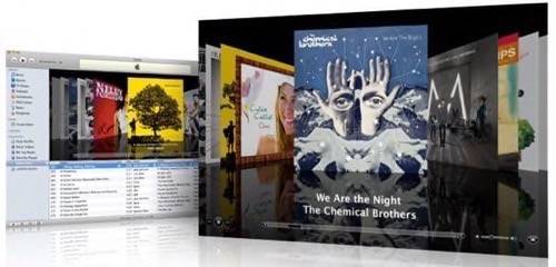
grandfather, everyone I know could use an iPhone right away. iTunes has so few buttons that it is impossible
not to know how to use it. And so does iPhoto and every other program developed by Apple.
In addition to simplicity, Apple has for years been using a contextual approach to user interfaces. Apple widgets
react to user gestures by changing shapes and presenting more options only when it makes sense.
And the latest web applications have got the contextual bug from Apple.
Contextual User Interfaces on the Web
It is ironic that it took web UIs so long to discover the elegance and simplicity of context.
Since its dawn, HTML lacked the sophisticated widgets that are present on the desktop and web UIs
were always considered more primitive and slow. Contextual, AJAX-based UIs actually seem faster because
they do not reveal all possible choices to the user. Instead they focus on surfacing just the bits that are necessary and then surfacing more based on user gestures.
A good example of context-based UIs can be found in modern video players. The controls in these apps
are hidden until the user moves the mouse over the player. Depicted below is the player from Vimeo.

Another typical element of contextual UI is modal DHTML dialogs. Regular modal dialogs are annoying to the user,
but the modal DHTML ones work great because they bring the actions into the spotlight. For example, the dialog below
comes up when the user clicks on Embed option in the screen above.

Note the contextual options in the screen above. The user can either preview the video or customize its look.
Neither of these options are required so they appear as closed off toggles. If the user decides to explore the option, the toggle simply expands as shown below.

Another important breakthrough in the contextual UI approach is the realization that
function is more important than design. The famous Apple mantra that design is the function
is true, but not everyone can design like Apple. Lots of web sites in the nineties ended up
with designs that were overwhelming and needlessly flashy. Those designs paid more attention to colors
and forms than to the function. The new UIs are different, because a lot of them are purposely plain.
They favor CSS over images, and focus on function and context instead of knock-out looks.
Lots of companies got the context bug. Flickr, Digg, and 37 Signals are just a few that use contextual interfaces. Our next example comes from the literary social network Shelfari, which developed a contextual UI for interacting with individual books. The remarkable thing about this UI is that it violates a lot
of classic principles yet it succeeds in delivering the necessary functions in a contextual and compact way.
When the user mouses over a book, a contextual popup comes up containing information about the book
and a set of associated actions. Part of the popup is a button/menu (sort of like a button and combo box)
widget that allows the user to provide information about what he or she did with the book. The first thing to note
is that combination of a button in a menu is not standard, yet it makes sense because it saves a click for the
most important action. Secondly, the menu is effectively a popup within a popup, which is a big no-no in the classic world,
but works well in this context. The elements of the menu are not buttons but check boxes, which allow multiple selection –
another violation of classic user interface elements, but which works very well in this context. What is remarkable is how
intuitive this gadget is – you are interacting with it in the context of a book and each choice is simple and clear.

Such clarity and simplicity was never present in the old interfaces. Clearly, this new approach to UIs is great, and early adopters are loving it. But will it cross over to the mainstream?
Can Contextual UIs Go Mainstream?
Crossing the chasm is a tricky thing and many cool technologies that are endorsed by
early adopters fail to do it. Even though simple, contextual UIs make sense, the old UIs are still holding on strong.
One of the early examples of a company that has adopted the new approach to user interfaces that we found is the Hertz car rental site. Hertz had one of the less user-friendly sites around, with a dull,
“click-to-load next page” sort of UI. Their new web site features an intelligent contextual UI, which enhances and simplifies
the process of reserving a car.

For the transition to happen the new approach needs to be embraced by more mainstream web sites. Will they go for it?
The answer depends on whether they will think that the new UI approach, with contextual choices, is more complicated.
Certainly there will be people who will say that consumers are not smart enough to figure out where to click.
The concerns might be amplified by the fact that each contextual UI is unique and so won’t be familiar across the board for users the way the old UIs were.
Still, it seems, based on our experiences over the past few years and on the impressive track record of Apple products, that
simple, contextual UI have a chance to finally win out over their complicated Windows rivals.
What do you think – can contextual UIs become the new standard for creating user interfaces? What are your favorite contextual UI elements?


