Visualization is a technique to graphically represent sets of data. When data is large or abstract, visualization can help make the data easier to read or understand. There are visualization tools for search, music, networks, online communities, and almost anything else you can think of. Whether you want a desktop application or a web-based tool, there are many specific tools are available on the web that let you visualize all kinds of data. Here are some of the best:
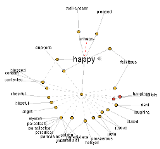
Visualize Social Networks
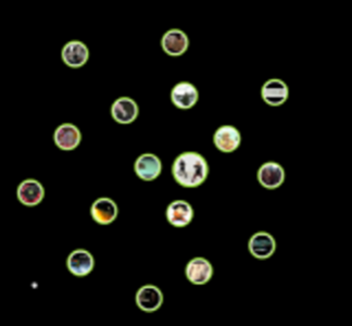
Last.Forward: Thanks to Last.fm’s new widget gallery, you can now explore a wide selection of extras to extend your Last.fm experience. The gallery hosts widgets for your desktop, for the web, for social networks, and much more. One of the better tools in the gallery, last.forward, is open source software that lets you map out any last.fm user and their connections. The web site for the software appears to be in German, but the “Download” button still works. And once it was downloaded and installed, I had no trouble using it myself.
Last Forward
Friends Sociomap: Friends Sociomap is another Last.fm tools that generates a map of the music compatibility between you and your Last.fm friends.
Fidg’t:Fidg’t is a desktop application that gives you a way to view your networks tagging habits. You can see what kind of music your network is into, or what kind of pictures they are taking. The Fidg’t Visualizer allows you to play around with your network. To use Fidg’t, you interface with the Visualizer through Flickr and LastFM tags, using any tag to create what they call a “Magnet.” Once a Tag Magnet is created, members of the network will gravitate towards it if they have photos or music with that same Tag. You can also search through the network for certain users, and see their recent photos and music. The Fidg’t interface is beautiful, too.
Fidg’t
The Digg Tools:
Digg.com has some of the best web-based visualization tools on the net, so they’re a must for any visualization list.

- Pics: Digg Pics is the latest tool that tracks the activity of images on the site with images that slide in from the left as people submit them and digg them.
- Arc: Digg Arc displays stories, topics, and containers wrapped around a sphere. The more diggs, the thicker the arcs.
- BigSpy: Digg BigSpy places stories at the top of the screen as they are dugg. Bigger stories have more diggs.
- Stack: Digg Stack shows diggs in real time, with diggs falling from the top of the screen. As stories get more diggs, they’re shown in brighter colors.
- Swarm: Digg Swarm draws circles for stories as they’re dugg. Diggers swarm around stories which makes them grow and get brighter.

One more:
. Although this is an unofficial visual aid, Digg Radar is worth a look too. With Digg Radar, you wait and watch for buttons to appear on the map which indicate that a person has Dugg a story. Hover over the button to see their username. Click it to see details about the story, with links to the Digg page or directly to the article.
YouTube:
You can discover related videos using YouTube‘s visualizations. To use this feature, go to a YouTube video, click on the full-screen button, and then click on the small button that shows a network. You’ll see a lot of video balloons appear and the configuration will change when you hover over a button.
Visualize Music
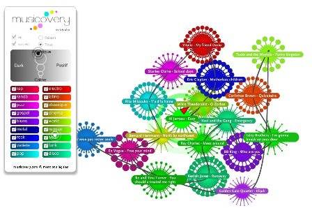
- Liveplasma and Musicovery let you discover new music.
- Tuneglue music map is a “relationship explorer,” similar to LivePlasma. Using data from Amazon and Last.fm, Tuneglue explores relationships between musical artists.
- Moody lets you tag your music collection with colors. They also have a color-coded web player. (our coverage)
- The Echo Nest is an audio analysis tool which takes an mp3 file, breaks it up into little segments, and gives pitch, loudness, and high-level timbral descriptions of each one of those segments. The program maps a subset of this audio data onto a visual scale and creates video playback of the song. (more)
- An interactive harmony model of music which geometrically describes relationships in harmony. The model can be a visualization tool for songwriters or students of music.
- Musiclens gives music recommendations and presents your current mood and musical taste as a diagram.
- Shape Of Song: What does music look like?
- Musicmap: connections are represented as connected lines; they create a web.
Musicovery
Last.fm music visual tools:
- Last Graph: Create artist wave graphs from your musical history in PDF and SVG format.
- Extra Stats: Colorful Stats and tag clouds.
Visualize the Internet
- Opte is a project that lets you graphically map the internet. The data represented and collected here serves a multitude of purposes: Modeling the Internet, analyzing wasted IP space, IP space distribution, detecting the result of natural disasters, weather, war, and esthetics/art.
- Akamai Technologies, who deliver 15-20% of all web traffic offered up some interesting tools last year for viewing their traffic data. (Our coverage) From their flagship app, the Real-time Web Monitor, which shows countries with the most traffic to the Network Performance Comparison app, Akami’s tools are an interesting way to see the web in real time. In all, they offer 6 Flash-based apps to the public.
- Other internet traffic visualizations include the Internet Health Report and the Internet Traffic Report.
- MantaRay displays the geographical placement of MBONE infrastructure (Multi-cast backbone) of the internet. Otter displays topological views of the (same) multicast infrastructure.
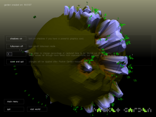
- Packet Garden is an app that watches your Internet traffic and builds a private world that you can later explore.
- Mapnet is a Java applet to visualize the topologies of backbones of major U.S. Internet Service Providers.
- Websites as graphs. An HTML DOM Visualizer Applet, which displays sites as graphs depending on the amount of links, tables, div tags, images, forms and other tags.
Packet Garden
Amazon
- LivePlasma: music discovery (see also music section of this list)
- Flowser is another flash-based Amazon visualization for search.
- BrowseGoods is a visualization that lets you zoom and pan Amazon’s catalog of products.
- Tuneglue music map is a “relationship explorer,” similar to LivePlasma. Using data from Amazon and Last.fm, Tuneglue explores relationships between musical artists. (see also music section of this list)
- Coverpop is more of an art project that lets you browse Amazon via a collage.
- Amaztype, a typographic book search, collects the information from Amazon and presents it in the form of keyword you’ve provided. To get more information about a given book, simply click on it.
Flickr
- Taglines lets you to visualize Flickr tags over time
- Flickrvision: view real-time flickr photos on a map.
- Flickrtime is a tool that uses Flickr API to present the uploaded images in real-time. The images form the clock which shows the current time.
Some details on these: see “Alternative ways to browse Amazon” (our coverage)
Miscellaneous
- Visual Thesaurus: The Visual Thesaurus is an interactive dictionary and thesaurus which creates word maps that blossom with meanings and branch to related words.
- Twittervision: view real-time tweets on a map.
- 17 More Ways to Visualize Twitter
- All the ways to visual del.icio.us collected here.
- Three Views shows three views of the earth, in which each country is represented by a circle that shows the amount of money spent on the military (size of circle) and what fraction of the country’s earnings that uses (color).
- We Feel Fine shows human feelings calculated from a large number of weblogs.
- Interactive History Timeline presents the history of Great Britain, divided into interactive data blocks.
- Winning Lotto Numbers shows the frequency of appearance of every number from one year to the next one.
- Language Poster – the history of programming languages
Sites Dedicated to Visualization
- IBM’s Many Eyes (our coverage) is a shared visualization and discovery service offering all kinds of visualizations you can explore or create.
- Informationarchitects.jp presents the 200 most successful websites on the web, ordered by category, proximity, success, popularity and perspective in a mindmap.
- VisualComplexity.com is an online collection of visualizations (our coverage)
- Infosthetics discusses the aesthetics of data visualization
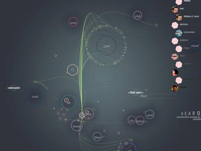
- Blogger Anonymous Professor is into visualization, offering visualizations like the 3D visualization/tour of classical music/composers, Visualization of the StumbleUpon network, the value of a Digg and more.
- Zip Codes visualized
Many Eyes
Search
Heatmaps:
Heatmaps site CrazyEgg applies heatmaps to tracking what visitors do on a user’s website. Their software captures user clicks on each page and then presents a summary in the form of a heatmap. Other heatmap sites include Feng-GUI and FuseStats. Summize applies heatmaps to shopping via their search engine(our coverage here, here and here).
Visualizing the Power Struggle in Wikipedia displays the most popular articles and the most frequent search queries in the heatmap.
Visual Search Engines:
- Riya’s Like.com: first true visual search engine does visual search for shopping.
- Searchme: upcoming visual search for the web
- Xcavator: A photo search engine which utilizes visual clues that you provide to identify and extract similar pictures from large groups of digital images.
- ManagedQ: A visual search experiment with some built-in semantics. (our coverage)
- oSkope: Visual search engine for finding products that searches Amazon, Ebay, Flickr, Fotolia, Yahoo!Image Search and YouTube.
- Quintura: visual search engine that uses clouds, tags, and highlighting.
- Tafiti: Microsoft’s experimental visual search engine running on Silverlight.
- Retrievr is an experimental service which lets you search and explore in a selection of Flickr images by drawing a rough sketch.
- Mooter: Visual search engine that organizes results In clusters.
- KartOO: visual web searc.
- SearchCrystal is a search visualization tool that let you compare, remix and share results from sources on the web, whether sites, images, videos, blogs, news engines or RSS feeds. (see also KoolTorch)
- Spacetime: search Google, YouTube, RSS, eBay, Amazon, Yahoo!, Flickr and images all in one 3D space.
- grokker: web search or enterprise search offering map views of data.
- Burst Labs suggests similar or connected items to your search queries in a bubble
- UBrowser renders interactive web pages onto geometry using OpenGL and an embedded instance of Gecko
- walk2web – enter a URL, then visually browse web sites linked from it
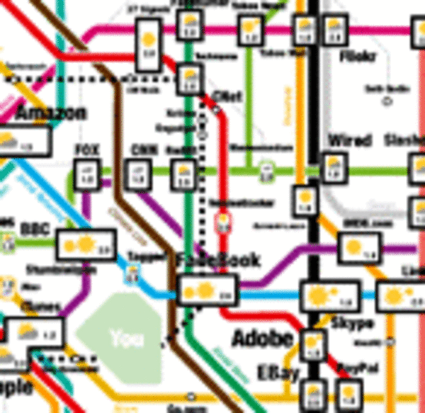
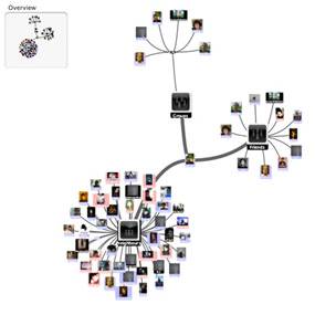
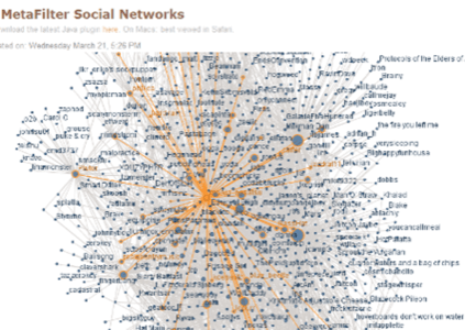
- TouchGraph‘s Amazon Browser, Google Browser, and LiveJournal Browser
Touchgraph

News and RSS
- Voyage is an RSS-feader which displays the latest news in the “gravity area”. News can be zoomed in and out. The navigation is possible with a timeline
- Newsmap is an application that visually reflects the constantly changing landscape of the Google News news aggregator.
- Universe DayLife displays events, connections and news as circles which gravitate around the topic they are related to.
Data
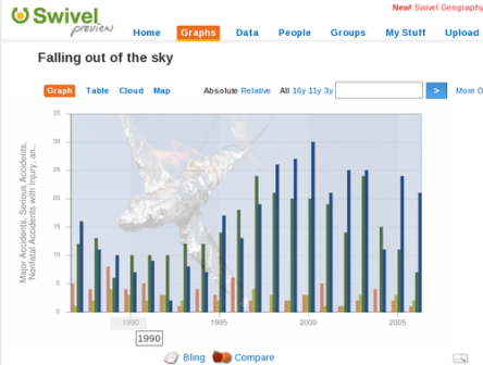
- Swivel create pie charts, diagrams and histograms.
- Xtimeline and Circavie let you create your own timelines
- The prefuse visualization toolkit – thebeta-version of a Java-based toolkit for programming of applications with integrated data visualization methods
- Dataesthetics Eric Blue on unusual Data Visualization methods.
- Smashing Magazine’s Diagram tool list
- America by the Numbers (Time.com)
Swivel