This is a guest post written by two of the researchers behind IBM’s Many Eyes app, Martin
Wattenberg and Fernanda B. Viégas. R/WW profiled
Many Eyes, a “shared visualization and discovery” service, back in January. Many Eyes
has been running for a month now, so in this post Martin and Fernanda showcase some of
the best visualizations, so far, and talk about the future of “social data analysis” on
the Web.
Background: How Many Eyes Evolved
The idea for Many Eyes came from some
surprising behaviors that we each serendipitously observed.
Several years ago, Fernanda was working on an email visualization program. When it
came time to run experiments, she was extremely careful to let her subjects know that
visualizations of their email would be completely private – the assumption was that no
one would ever want to reveal their personal mail. To her surprise, her subjects
immediately began to ask for ways to share the visualizations with others! In fact, it
turned out that the process of storytelling and reminiscing was one of the most valuable
aspects of the visualizations.
Martin’s serendipitous experience came two years later, when he created a baby name visualization to
illustrate a book that his wife had written. After the site went live, he spent an
embarrassingly long time doing Google searches to find out what people were saying about
it. His self-centered surfing was rewarded with the discovery of many large, detailed
blog conversations in which users – who often had no immediate interest in naming babies
– speculated about various trends and patterns they’d found in the data. In aggregate,
the analysis of the data was both deep and broad – uncovering a huge amount of
information.
These two experiences were the motivation behind Many Eyes. We wanted to find out
whether these experiences were flukes, or whether there really was a powerful social
angle to visualizations. And we felt that the only way to find out was to create a
participatory website available to the entire internet – to create not social software,
but societal-scale software.
This represents a break from conventional visualization research. Traditionally,
computer scientists concentrate on scaling in terms of data, making visualizations work
for bigger and bigger databases. Our agenda is to scale the audience, not the
data.
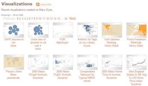
Many Eyes Visualizations homepage
Social use of visualizations – what’s happened in the last month
Many Eyes was launched a little more than a month ago. By the way, the original
Read/Write Web article listed “Fernanda and Martin” as the developers – in fact
everyone in the IBM Visual Communication Lab has worked on the site, and probably the two
of us did less of the actual development than anyone else!
So what has happened? Was our hypothesis about the social use of visualizations
correct? It’s too early for any scientific conclusions, but that won’t stop us from
giving some anecdotal evidence 😉 Here are three anecdotes:
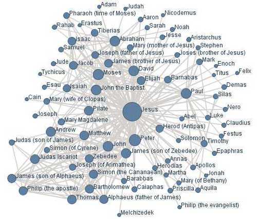
1. One of the earliest users of the site uploaded a set of data that described which
figures in the New Testament were mentioned together, and then used our graph
visualization tool to create a network diagram of these figures. You can see this
visualization here (screenshot below) and the blog post they wrote about it here. This network
got picked up by a whole community of bloggers who were interested in the statistical
analysis of the bible – we counted more than 100 trackbacks on the ESV blog where it was
posted.
New Testament figures visualization
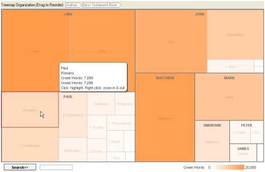
This in turn led other users to upload their own data to create visualizations, such
as the
proportions of New Testament authorship:
New Testament authorship visualization
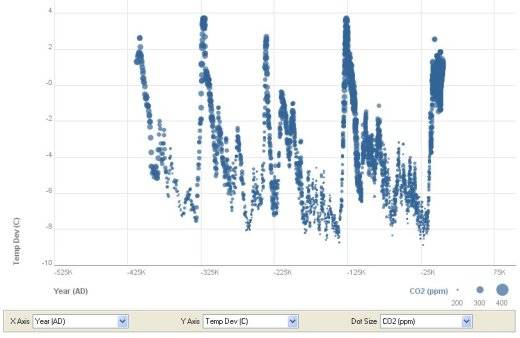
2. Another user uploaded a set of
data on global warming. In this case, most of the discussion occurred on the site
itself – where there was a heated (if you’ll pardon the pun!) debate over the meaning of
CO2 and temperature trends in recent years.
Global warming visualization
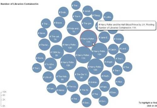
3. A frivolous example, that nonetheless shows the social aspects of the site, can be
seen in this visualization
of books. Entitled “Harry Potter is Freaking Popular”, the diagram is a bubble chart
that shows the top 50 books on LibraryThing. In this case, the comments hold not much
analysis. But we started a little game: we realized that we could use the highlighting
feature of the chart to show which books a person had (or hadn’t) read. As of this
writing, a dozen people had participated in the “game” of showing what they had or hadn’t
read.
Library books visualization
What’s Next?
A lot, we hope! We think that social data analysis is a lively area right now
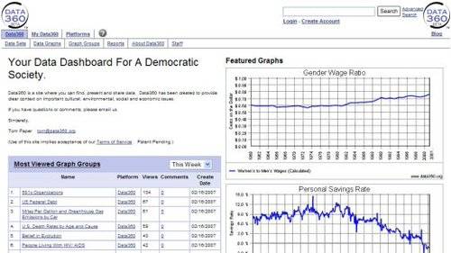
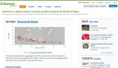
and we are not the only ones exploring this space – two other sites of note are Swivel and Data360. Each of the 3 sites has a different emphasis,
but what we have in common is a belief that the web enables a new, social kind of data
analysis; a type of statistical thinking that is both playful and serious. We’d argue
that this is just one way in which visualization is becoming a new and important mass
medium – but that’s a blog entry for another day…
Swivel
Data 360